My role:
designing a new feature for an existing app as a UX designer from research to high fidelity designs.
Duration: 40 hours
Tools: Figma, FigJam, Maze
Wells Fargo is a major bank company in the U.S. and they have a high satisfaction rate, overall, on their services but had a lower rate on mobile banking service.
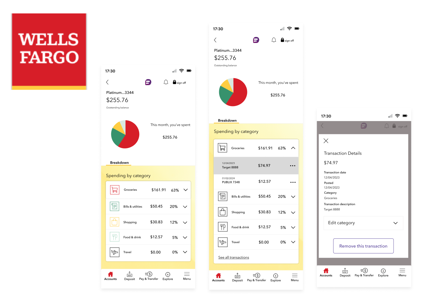
To have a better service, I designed a monthly spending page, where users can view their spending monthly and sort transactions by category.
Coming up with a new feature for that kind of big company was nervous and challenging for me, but I learned many things about the design structures the major companies used.
Wells Fargo app already had the basic necessary features as a bank app, such as transferring money from one account to another, depositing checks, and reviewing past transactions.
It seemed at first that there was no freedom available to design a completely new feature, but I learned the weakness of the Wells Fargo app design as I conducted the user research.

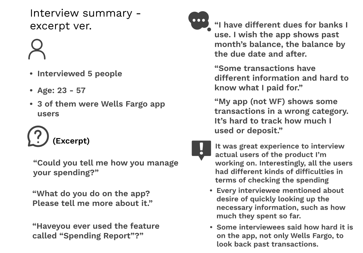
I reached out to 5 interviewees who are either currently using the Wells Fargo app or the competitors' bank apps.
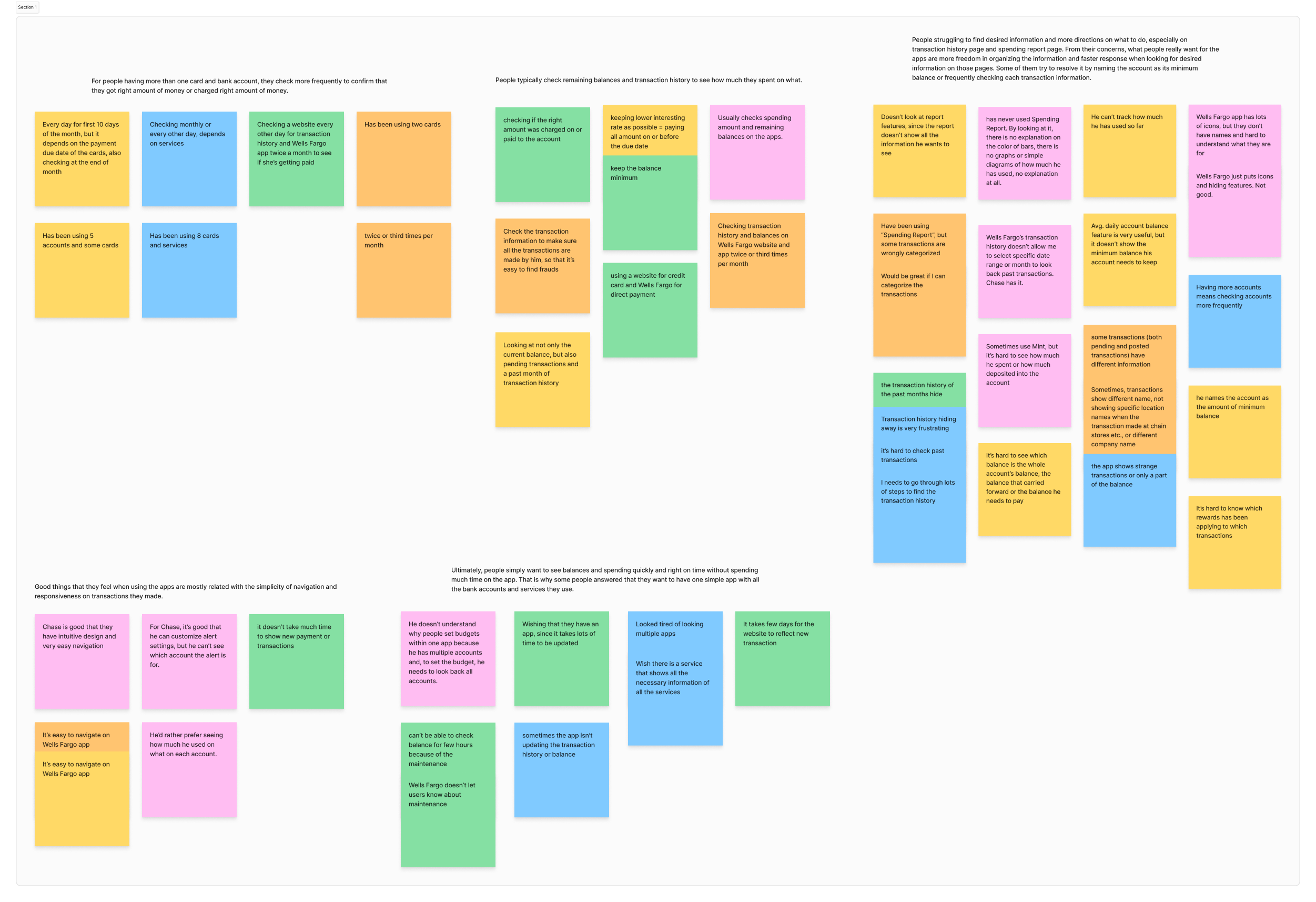
Overall, everyone mentioned that the apps they use were nice, but not sometimes showing correct information, being able to customize in a certain way, and hard to find some information right away.
(You can view this image enlarged by clicking it.)
Through sorting the interviewees' comments, I learned the following key insights:
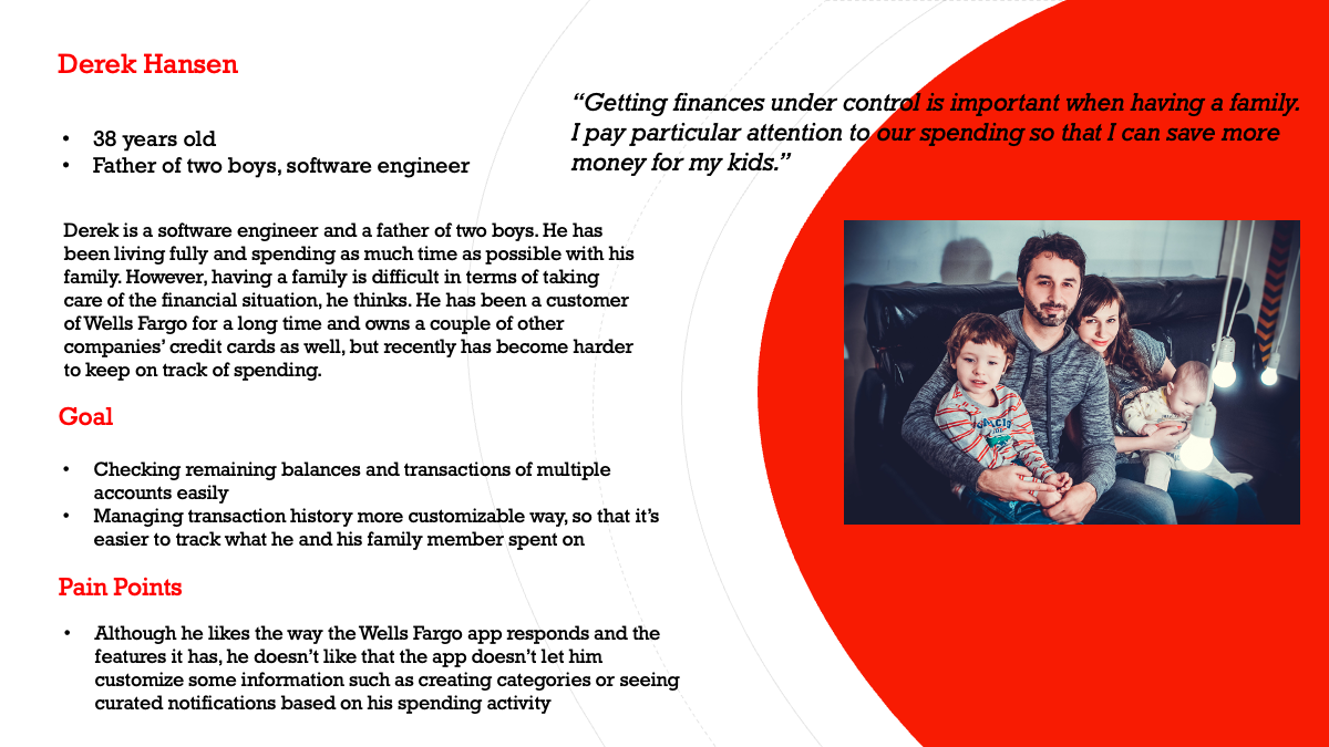
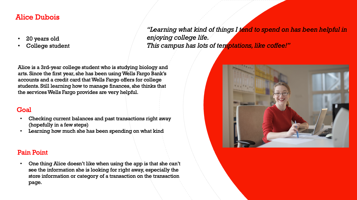
Based on the user interviews, I reflected on the interviewees' two main pain points of "looking at necessary information quickly" and "organizing information in a customizable way to find the right information right away" on personas.
One of them has a family, in which managing finances becomes challenging by having expenses for different purposes, and another is a college student, who is busy with studying and being responsible for their own life. Creating personas helped me focus on resolving the user problem, not my problem.
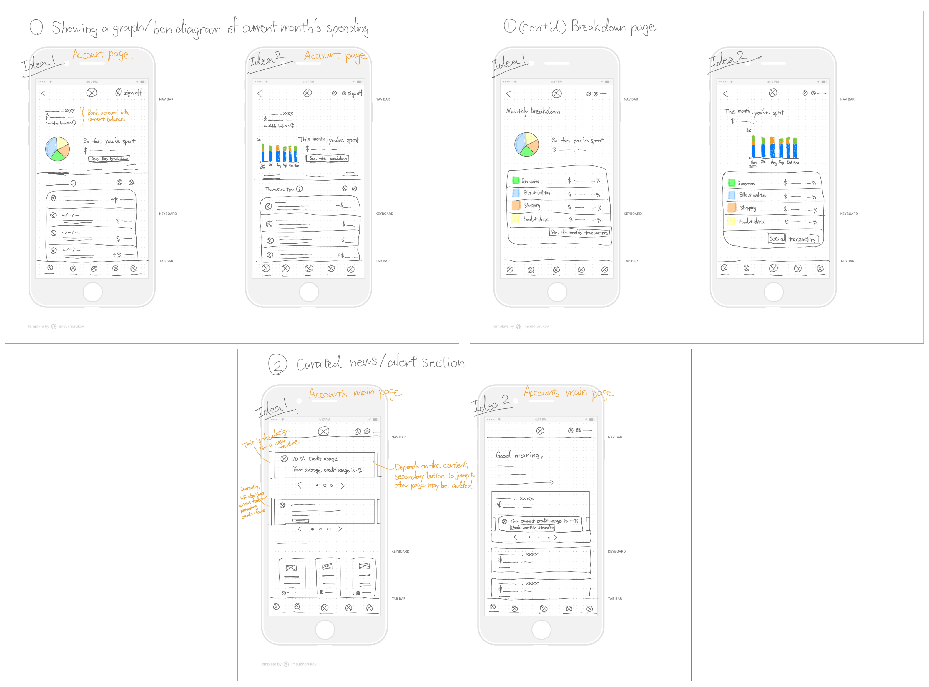
Through the research and personas, I decided to create a new monthly spending page, where users can see their spending through a diagram and all the transactions sorted by types of transactions ("Category").
On the page, users can also create categories and move the transactions to different categories.
I also came up with an alert feed, since interviewees wanted to look at necessary information quickly. However, I did not work a lot on that feature because the Wells Fargo app already provides a bit similar service (just to show ads about opening new account and investment service) and it will be more like redesigning process.
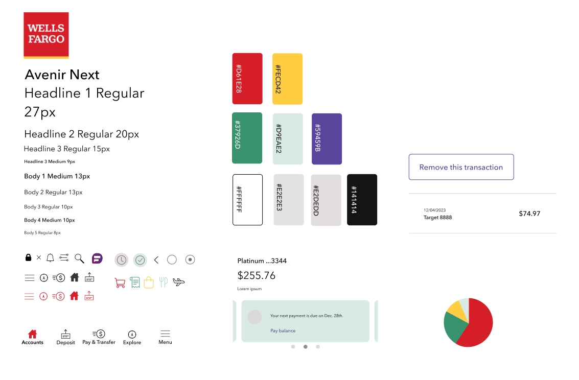


I tried to follow the original designs that Wells Fargo was using by applying similar UI styles and components.
I also tried to design the feature as realistic as possible by adding multiple interactions on prototypes: swipe to delete, accordions that smoothly open and close without disturbing other elements, and a bottom navigation bar that doesn't move when scrolled.
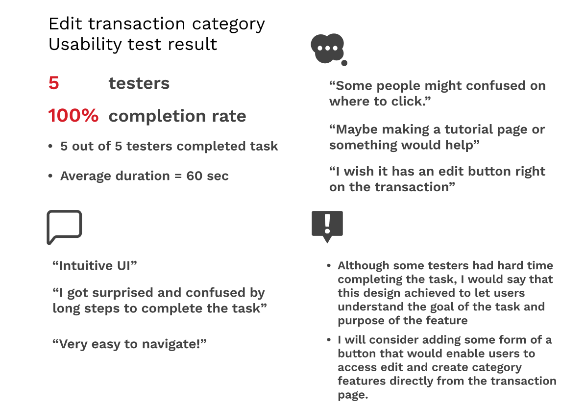
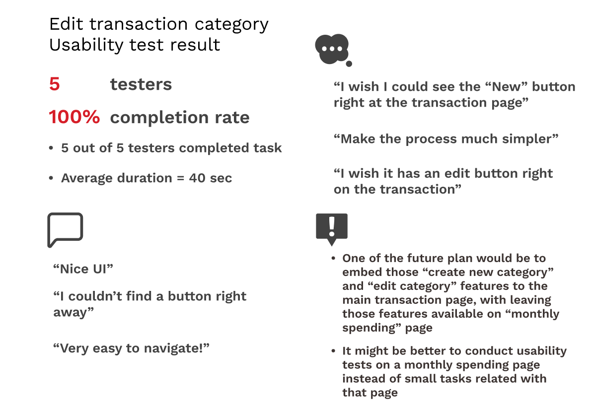
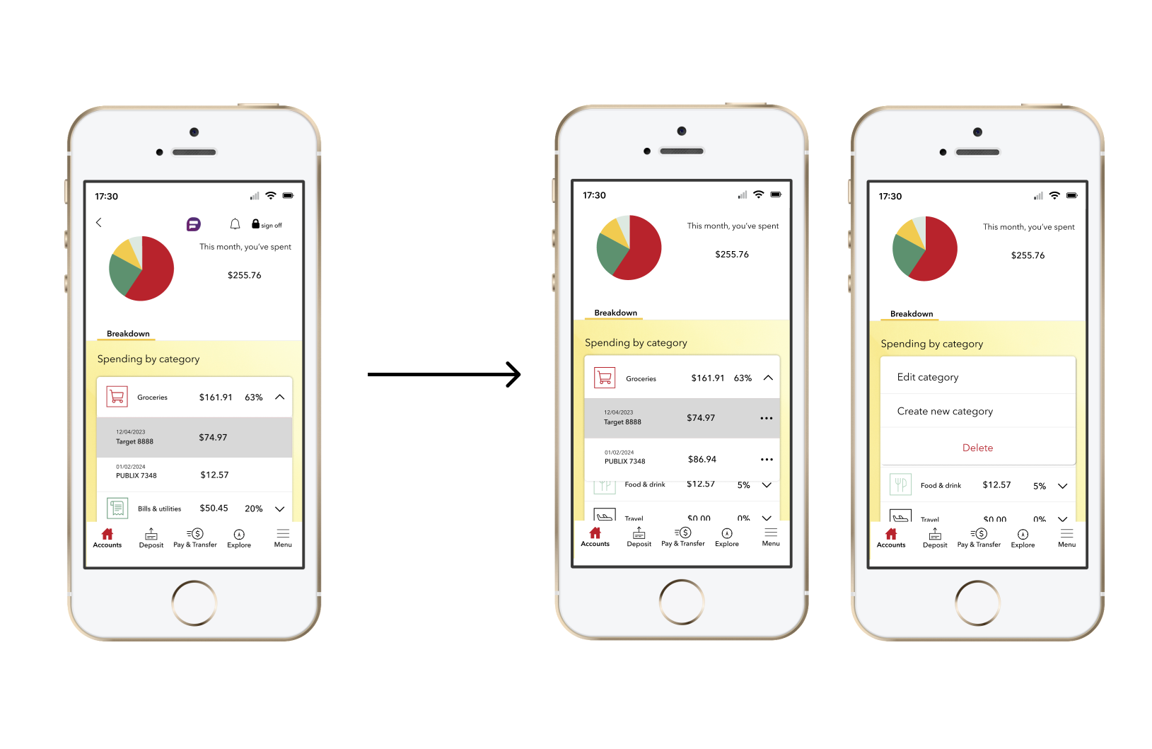
Based on the suggestions and pain points from testers, I revised the process of editing and creating transaction category. Instead of clicking transactions and other buttons multiple times, I added the "meatballs menu", a three horizontal dots menu button to enhance usability and improving the ease of reviewing transactions.
Although some features wouldn't work yet, feel free to experience my prototype!
Although the project is over, there are some areas of changes I could make.
Some testers suggested making a separate page for tutorials or directions on how to use major features including the features I designed. And, even though I revised the design, it still needs a better UI and improved interactive design.
I would also make some changes to the alignments of the UI elements to look better.